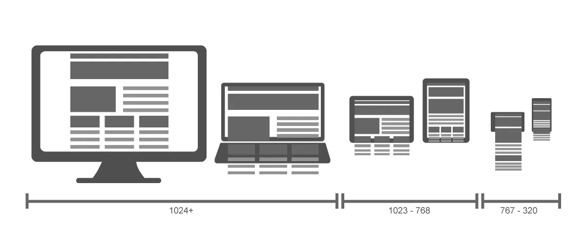
The website should respond to the users according to the device, screen size, and orientation. Created with the responsive design method to display optimally at a range of sizes, no matter what device or screen resolution the user is using.
Responsive design allows creating flexible websites that adjust to fit the device and user. It is the approach that proposes that design and development respond to user behavior and the environment based on screen size, platform, and orientation.
This is done through the use of flexible grid layouts, adaptive images, and CSS media queries, it is really an ideal solution as the responsive design seems like a godsend when it comes to viewing a single website across multiple devices. Keep in your mind that creating one site for multiple environments will require lots of testing. It’s an effective way to create a website that adapts to a variety of devices.
Tiye solutions responsive web design ensures that your website will adapt to each unique device used to access your site.
The main elements of responsive websites design
If your website is relevant and professional, visitors will not only stay on your site longer and search your site's content, but they are more likely to buy from you as well.SO don’t waste it with a low-quality website.
We all want our websites to be great not only by visiting but also by returning and turning your website into an income-generating engine.
The main elements of responsive websites design
Flexible Grids
Are a core part of responsive website design, as designers have to make sure that the grid is flexible and can load differently based on the screen size. Break points
Breakpoints are the points on the page you define where the page can be clipped and information moved on the side down.
Every website should have at least three breakpoints for the three main types of devices people use, but most websites have more than three.
Flexible images and responsive media queries Text is easy to move around based on screen size but images and media are likely to be more difficult, so there are several different options designers can use to ensure images appear at the right screen size, without causing slow loading times or looking weird.
Also, there are also coding commands designers can use to ensure any media included on a page-load in the right size.
Visual hierarchy
A large part of website design with a responsive layout always considers the parts of the page that have the highest priority.
The images and messages that are most important to your visitors should appear at the top of the page Visual hierarchy is a good practice for web design in general, so make sure the most valuable parts of the page are accessible somewhere higher.
You should use responsive web design as:
An adaptive design and flexible layout provide a better user experience for your visitors and also help to boost your search engine optimization value.
Internet use now occurs more on mobile devices than on desktop computers. Mobile is a trend that will continue to exist, and website owners will have to adapt to it. You don't want to alienate more than half of your website visitors by giving them a poor user experience. So your website should work for everyone easily, and responsive websites are the best way to make sure everyone that visits your website gets the experience you’re aiming for.
Saves your time due to having two websites comes with certain issues, as it takes more time to create two websites than it does to create one responsive website, and you will double your efforts when it comes to creating websites and when it comes to updating them over time.
In addition to responsive websites make tracking analytics easy in one place and make sense out of them when you’re dealing with a relatively consistent experience across devices.
The best responsive websites automatically re-size all onsite content, images, and functionalities for mobile, tablet, and desktop.
Responsive Web design is not only about adjustable screen resolutions and automatically resizable images it’s also about a new way of thinking about design.
Dynamic content that changes
• Navigation is condensed
• Adjust screen resolutions
• Custom layout structure
• flexible images
• Correct padding and spacing
• Reliant on mobile operating systems to function
You’re at risk of losing a lot of business if your business depends on its website to any extent, and you haven’t made the switch to a responsive design
Every client these days wants a mobile version of their website. It’s practically essential after all one design for the Samsung, iPhone, iPad, and notebook and all screen resolutions must be harmonic. So Tiye Solutions is professional at creating website and responsive web design, we always here for you and for your brand to help the users switches from their laptop to their iPad, and so on, the website
professional responsive web design should switch automatically to accommodate resolution, image size, and scripting capabilities.
Your website will have the technology to automatically respond to the user's preferences to eliminate the need for a different design and development phase for each new tool on the market.
Tiye Solutions aims to deliver creative, easy-to-use, and secure responsive web design by using the latest trends, personalize branding identity, and modern tools developments for your business so we recommend testing across platforms. It’s tricky enough to design a website that is usable on a desktop.
In addition to if users immediately see what they want on their desktop screen, they can take a quick look around the website page to discover it Tiye Solutions focusing perfectly on the content due to it’s one of the key aspects to doing responsive design well.